Peerless Watercolor Palette Tutorial
I’ve got a Peerless watercolor palette tutorial for you today! No idea what I’m talking about? Do you like watercolor? I promise you’re going to love this. I’ve already shared a recent video of the Kuretake Gansai Tambi Watercolors which I just LOVE. But I’ve been itching to share another totally different, favorite of mine which is the Peerless watercolor. More specifically, a tutorial on how to create a beautiful storage palette for them, which you can take anywhere with you easily.
You may have noticed I LOVE watercolor. All of it. A-L-L forms of it. I’m sure you understand. 🙂 Several years ago I found myself bed-ridden and unable to create with my art supplies. They were either too messy for sitting in bed, or not light enough for my hurting body.
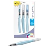
I’m not sure how I’d never discovered watercolor pencils before that time, but when I did my life changed. I was able to put a small art journal on my lap, color away with watercolor pencils and then make it all come to life with a Pentel water brush loaded with water in its handle. I could hold very little in bed and create again, which was pretty therapeutic and enjoyable. God was good to me.
Peerless watercolor
If ONLY I had known about Peerless Watercolor! Talk about having a light-weight art supply you can take anywhere with no mess. And the sheer range of color available in such a small amount of space! I continue to love watercolor pencils and find them handy for travel but really do just love what I discovered in Peerless watercolor.
Peerless watercolor was created in 1885 as a solution for hand-tinting black and white photos with a little color. It is a beautiful transparent pigment which is entirely different than any other watercolor available on the market. As the Peerless website explains, “The color is coated on one side of a special paper fabric that readily discharges when it comes into contact with water or any soluble mixture. The color sheet is a heavy film of highly concentrated pure color of intense strength and absolute solubility.”
You pick the color up off the embedded sheets, by tapping a damp brush to the surface. There is so much concentrated pigment on each sheet. Don’t be alarmed if they arrive with some having random patterns on their surface. It’s just the nature of the product and fun to see what you end up with.
In high school, I had the joy of working in a dark room to process film. There is something so beautiful about the film process of photography. It was in the dark room that I learned the value of how much can actually take place in one second of time. The question isn’t about how much time we have in life. It is how meaningful we make each moment.
Anyway, hand-tinting photos was something I did back then, but was never introduced to Peerless watercolor at that time. Perhaps because it’s only in recent years gotten so popular again. It has become rather popular with card makers and watercolorists alike, because of its lightweight nature.
I think those in my Bible Art Journaling Challenge will find the Peerless watercolor to be particularly special, since it is a more transparent type of mineral watercolor than many on the market. And, it is great quality. So it is more lightfast and vivid than many others. A little goes a very long way. Wonderful value for money spent in my opinion.
There is a ton of color on each sheet of Peerless watercolor. The color looks very deceiving on the surface and the only way to understand which color you’re about to use, is to have some sort of swatch, or try it out first. And of course there is the thought of how best to store bits of paper which should not access water unless intended to. 🙂
Peerless watercolor options
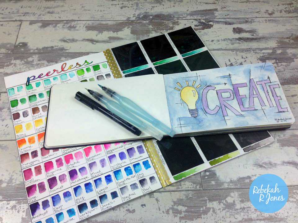
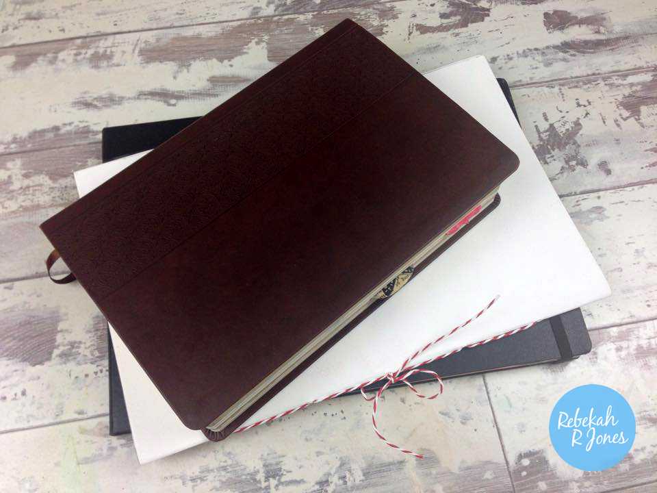
While I love that so much artist grade, transparent watercolor can be embedded onto such a small sheet and take so long to run out of, it really lacks a quality storage solution. After looking online a bit to see what solutions others had come up with, I put together my own Peerless watercolor palette.
It is a beautiful little hand-bound booklet, which I can slip in to my bag next to an art journal, Pentel water brushes, (with a couple brush tip options) and a thin Faber-Castell Pitt Pen from my black set, for sketching. This Peerless watercolor palette means I can have a wide color range of watercolor at my disposal, while away from my art desk.
I am guessing that moms of young children would love these for being able to take their creativity to a space near their children, (if they get a spare moment!) without bulky things to carry or take up space. Plus, the brief “pack up” time is unmatched in my opinion. I personally enjoy painting during church worship services at my seat and these are so compact for that. Urban sketchers enjoy Peerless watercolor too. Nothing like having tons of color while sketching on a busy street corner. The uses are limitless it feels.
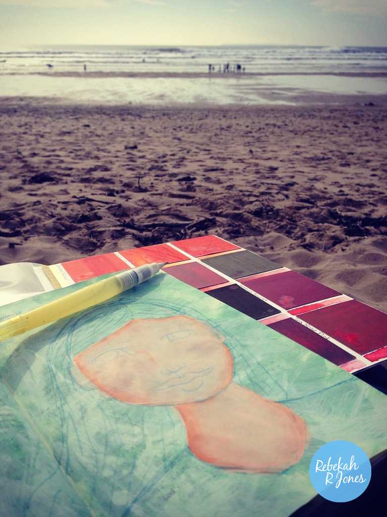
I love the Kuretake Gansai Tambi Watercolors for creating in my art studio and particularly love their metallic options which Peerless lack in these sheets. But, Peerless are amazing for “on the go” creativity. You can see from my trip to the beach recently, (where my husband caught great waves!) that I am getting good use out of them. 🙂
My Peerless watercolor palette adds a meager 5.9 ounces, (166 grams) of very flat weight to my travel bag. What’s not to LOVE?! You can see how it compares in size to my Moleskine watercolor journal and my Note-Taker’s Bible, which I also art journal in for my Bible Art Journaling Challenge.
I have seen people create a little Peerless watercolor palette on YouTube. All of which were interesting, but I didn’t like how most people tend to cut their sheets down to little bits and then store the rest away to add in as needed. I also noticed most people don’t create space for the name of the different colors or a sample page with swatches of everything together for easy reference.
Video Tutorial
With all that in mind, I went about creating a beautiful little Peerless watercolor palette booklet with ALL the bells and whistles I could imagine desiring. And, I LOVE it!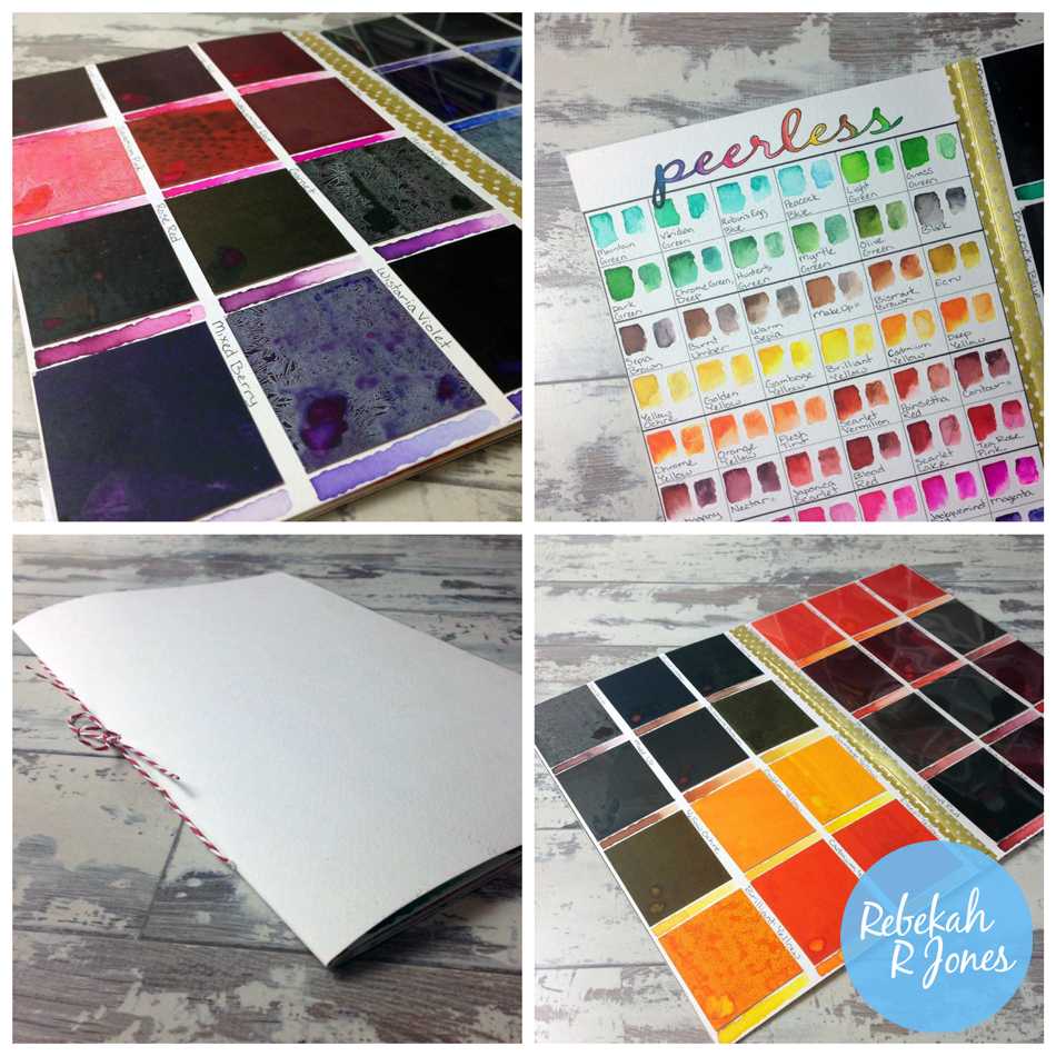 I knew I would love it, so I turned on the camera to capture the fun. Let’s get started with my video tutorial! I’ll show you a simple book binding technique, how to use these watercolors and much more! Learning how to make a Peerless watercolor palette is just fun to watch come together in my opinion. 🙂 The techniques I share could be used in all sorts of creative applications. Lets do this…
Peerless watercolor palette
Isn’t it gorgeous?! Maybe I’m partial to art supplies. 😉 I think it may be one of my favorite art supplies. But how does one choose?! The bonus to my video tutorial is that little simple guide on book binding! If you like the idea of binding together some loose papers for art journaling, I imagine you’ve enjoyed my simple tutorial.
Choosing your Peerless watercolor set
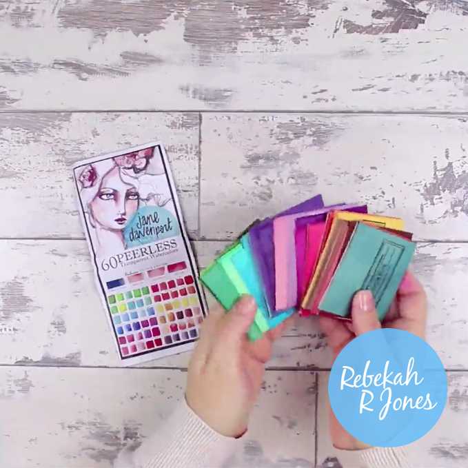
If you want to follow along with what I’ve done or just want to try out the Peerless watercolor, you’ll need to pick a set that is right for you. They come in a range of different options. I researched them fully before buying and went for the largest set I could get my hands on. You can decide what is right for you and make a Peerless watercolor palette that is the right size for you.
You could, like many people, take your sheets and cut them down to smaller sizes and make a palette that holds just the smaller 1×1 inch sheets and save the rest as replacements. This would make your palette lighter in weight but I find mine to be plenty light and enjoy the space I have to write color names and create decent swatches. All the sets have fun colors and some colors overlap in different sets. Just work out which you prefer.
Click images to view art supply details or to purchase.


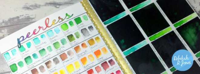
Peerless watercolor swatches
If you follow my social media, you’ll know I’ve been making swatches of just about every art supply I own. Why bother? That’s for another blog post. But, the simple answer is because they really help with your creative process. Some have asked why I put a page of swatches at the beginning of my Peerless watercolor palette. And, why there are two of each color.
As I mentioned in my video tutorial, the left side of each box has the color applied directly onto the heavy, cold press (rough in texture), watercolor paper. On the right side of each box, I brushed on a square of Winsor & Newton white gesso, before brushing on the same color as have left of it. 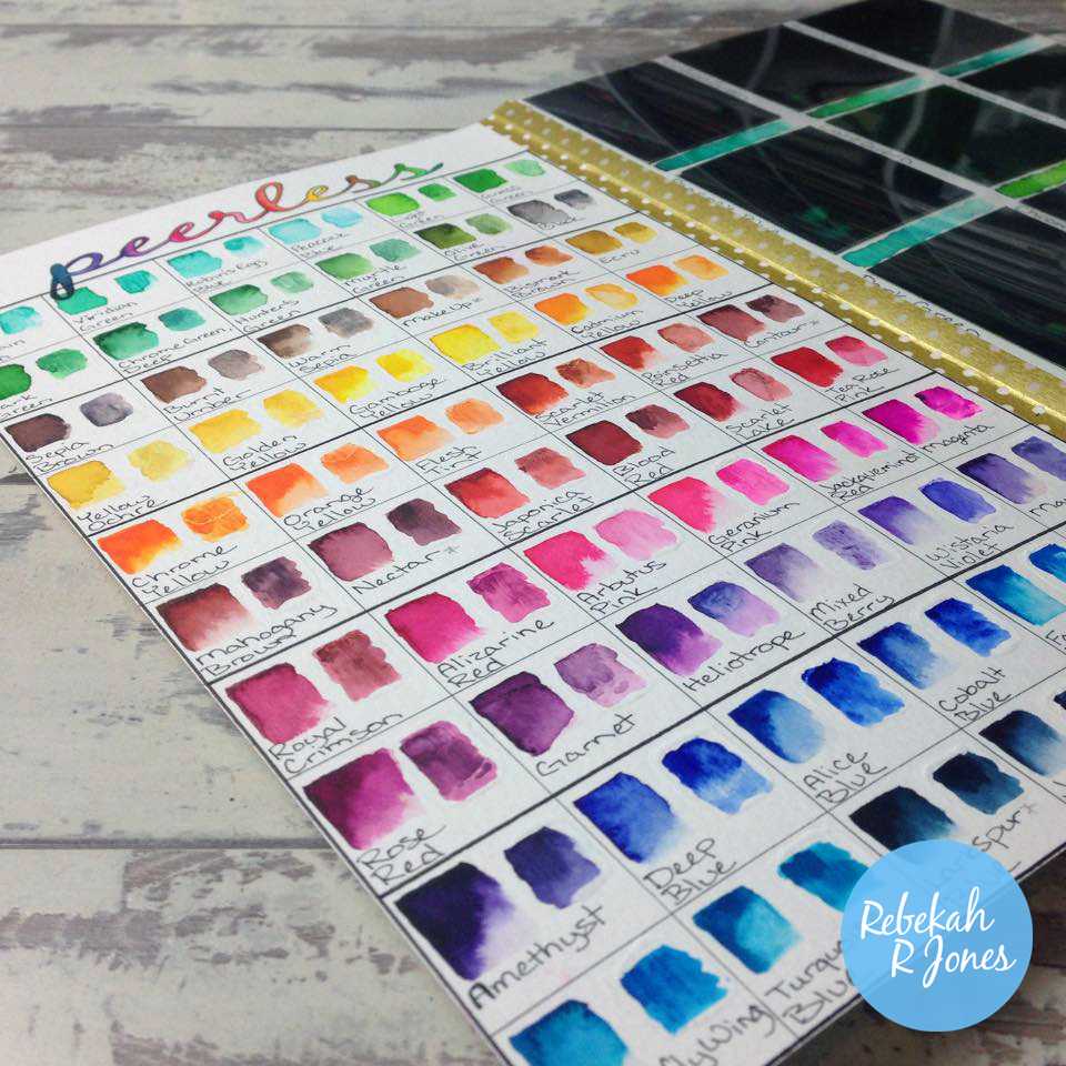
Creativity preferences
I am a mixed media artist who favors watercolor. I use ALL SORTS of art supplies in my creative process and I often use watercolor in my pieces. For me, I use watercolor paper with no primer (gesso), just as often as I use surfaces which have first been primed with gesso. I wanted a quick reference of how my colors act on each surface as while it is very similar, you can see for yourself the results vary a bit between them.
Watercolorists will say that watercoloring on gesso is wrong. And, for their art medium, it essentially is. But my art style is mixed media with no rules. So, there are no rules. I often use gesso to my advantage to make my color do things they wouldn’t do on other surfaces. Other times I love it right on my paper. It is all an opportunity to explore new creative possibilities. At least I’ve told you where I’m coming from when I give creative advice.
I encourage you to always explore the limits and possibilities of your art supplies and decide what works best for you – what you fall in love with replicating. Then, add other art supplies to that same love and see what art supply and technique marriages, bring you sheer bliss. My Peerless watercolor palette is one for me. It belongs in my top five. 🙂
Using swatches as a reference
I use the front page of my Peerless watercolor palette, as a quick reference and guide to the color range I have, as well as the ways it will act on the two main surfaces I’d likely apply it. Moving on from that first page, I didn’t want to just slap my colors in there and have no idea where to find what I’d referred to on that first page. So, I made my palette colors flow, with room for the name of each color on the side of each Peerless sheet, with a swatch of the color to refer to right next to the sheet.
I often look at a color on the first page, rummage through my pages looking for “the blue section”, find it, look for the color I thought I saw (by viewing my samples under each Peerless sheet), and when I need to be sure its what I wanted, I can match up the names. Then, I know I’ve got what I’m after. It works equally well to stare at my first page of swatches and decide on a color range for a piece I plan to do, without the disruption of flipping pages. Seeing it all next to each other works great for me.
Alternatively, I can know I’m “using blues today”, go to that section and have little samples under each sheet to show me in that section of my palette, just what I’m looking at using. Vital since the colors are so different in use than with that high pigmentation built up on each Peerless sheet. I’m just telling you what works for me and if it helps you decide how to build your own Peerless watercolor palette, that is great! If you do go on and create one, please do share it with me! I’d LOVE to see your Peerless watercolor palette! 🙂
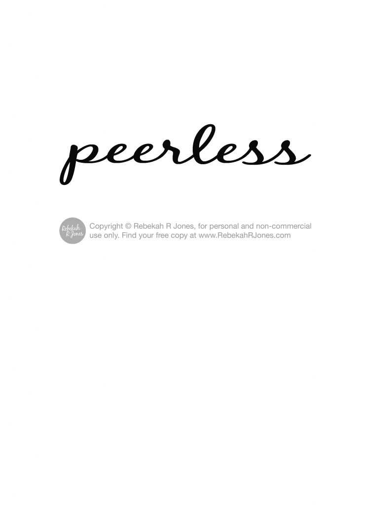
Free download
I’ve included a free download here for you, just in case you’d like to print and use my lettering which I used for the first page of my Peerless watercolor palette. You’re welcome to use it for non-commercial enjoyment! Have fun! You can right-click with your computer mouse over my image below, then select to save the peerless download image and use your computer to then print the image you saved.
 Peerless watercolor palette supplies
I imagine you’d hope for me to lay out all the measurements and details for how to make my exact palette. This post took me a long while to put together and would have been SO long with every detail. Instead, I’d rather give you the understanding of how to do what works for you. Why? Because you may want to apply the idea to another set of Peerless watercolor than I have anyway.
I will list all my supplies here for you, so you can go on and make a Peerless watercolor palette that suits your needs. I hope my video tutorial will be enough for you to replay and work out details you want to know in case you love JUST what I did. I sure do. 🙂
Here are the supplies I featured in this video which you can click on to view or purchase. I hope it helps you find anything you may want to try out. I receive a small percentage of each purchase when anyone clicks on my art supply links, to go get supplies I use like you see below, or on my YouTube videos. This has no effect on you and makes a real difference for me! I am excited for you to get great deals on supplies anywhere, so you can join me on your budget. When you find deals which I’ve searched for and recommended below, I get supported. Thank you, I so appreciate your support which helps me provide free tutorials and videos for you!
Click images to view art supply details or to purchase.


Other peerless watercolor options
Before I finish with you here, I wanted to embed below, a playlist I made to show how others on youtube, have made a Peerless watercolor palette and other storage solutions for them. It may just give you ideas for what suits you best. I love what I’ve made because it is best for my lifestyle but do what works for you.
I hope you’ve enjoyed my Peerless watercolor palette video tutorial today and my introduction to it. I’ve enjoyed sharing it with you and look forward to hearing if I’ve been able to help you decide how it might suit you! Leave me a comment below. I’d love to hear from you!
You are loved. x
 (2 votes, average: 5.00 out of 5)
May 24, 2015 @ 6:43 am
Rebekah,
This is an amazing tutorial. I truly enjoy watching you create on your bible weekly, and getting to know you a little bit at a time through your testimony and stories. I am looking forward to joining you in the Challenge.
If you could suggest the ONE product that I should definitely have in my collection that I could use to follow along with you, which one should it be (first)?
1. Watercolor pencils
2. Peerless watercolor swatches
3. Gelatos
4. Other …
Take care love.
Isaura
May 26, 2015 @ 9:06 pm
You are sweet. Thanks. Oh boy… to choose a favorite. I’d say if you’re limited in supplies, Gelatos will do multiple things and are most versatile of all the options you mentioned. But really, own them all in time. 😉 They are all so nice!
May 27, 2015 @ 2:51 am
I’m glad you explained about the magazine and how you were unable to post this until now. I saw someone make a very similar booklet and thought it was a great idea. This was some time ago but not before your magazine spread came out. At first I thought you had copied her and didn’t give her credit. So now that you have explained in this post, I realize it was probably the other way around. Anyway, it is really a great way to store and use your set and so very functional. I will be copying your idea and appreciate so much the download that you made available.
May 27, 2015 @ 12:25 pm
There are so many ways and ideas for making a palette for Peerless watercolor that I’d also struggle to give any particular person credit. This is not a new idea but certainly my take on it and anyone is welcome to take my tutorial as a help for themselves. 🙂 Have fun making yours!
May 28, 2015 @ 2:25 pm
Thanks for this tutorial. I have some of these peerless watercolors and had forgotten all about them! Time to get them out and make something pretty! I haven’t had the nerve to paint in a Bible yet, but while I was watching this I had the idea of finding an old dictionary with similar thin pages at a thrift store or garage sale and do some sample art on that for practice and confidence building.
Apr 18, 2016 @ 5:50 am
This is an amazing tutorial.You clearly put a lot of time and effort into it and I, for one, appreciate that a lot! I made my own Peerless Palette that, while very cute, did not turn out to be functional. I used sheets of transparent plastic intended for slides. There are 24 pockets on each sheet. I cut out 1.5 x 1.5 pieces of Peerless and mounted them on a slightly larger piece of heavyweight paper. I wrote the name of the color on the bottom and a sample paint strip of the color on the top, with the sample part sticking out of the window.
I am sure you already recognize the problem! I have to pull the piece up out of the window to use it, in and of itself not a problem. But then each has to dry thoroughly before it can be pushed back down into the pocket.
So I am starting anew and using your idea, which is much better than mine. Thank you for taking so much time to give instructions and including a video. I love crafting!!!